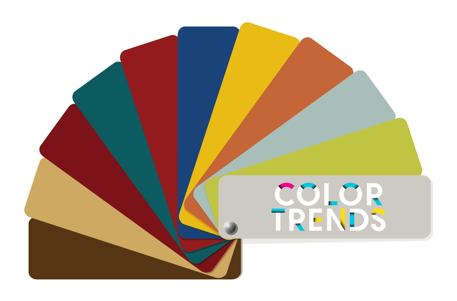
Just as the seasons change, so do color trends. Driven by a wide variety of factors, the “colors of the moment” evolve over time to reflect current tastes and trends. This is not a simple case of cause and effect. The factors can include fashion, social trends, new innovations and products, and even the economic climate. None of them are singularly responsible. Instead, they affect one another to develop the current trends. As a result, our use of colors changes along with them.
To keep up with ever-changing trends, home decor and furniture companies frequently need to re-evaluate their color story. But why? What’s involved? Where do they draw inspiration? Read on to learn more about color trends and how we at Seasonal Living are evolving our story.

RE-EVALUATING A COLOR STORY
We have been spending a great deal of time contemplating our next color moves. Seasonal Living has long been known for the rich color in our products, notably our CERAMICS COLLECTION. As such, we want to be sure we are offering a range of colors that continues to fuel the imagination of designers and clients. Of course, we will continue to carry a large spectrum of color… just an updated spectrum.
Neutral basics with pops of color are our trademark. Our slight shift will focus on expanding the range of neutrals. To add a bit of personality, our bolder color story will be centered around rich luxurious neutral palettes which, when paired with distinctive forms, provide the foundation of our color story. Then, saturated colors punctuated with jewel tones are our ways to allow our customers to create their unique story to reflect style, design message, and unique specifications for the end consumer.
WHAT’S INVOLVED?
The first thing to consider is ‘where are the trends headed?’. This doesn’t mean today but in the coming few years. Surely, some of this is unknown, but with enough research, one can reasonably make an educated guess. There are many experts who study trends and, while we try to be ahead of the wave, their insight is incredibly useful in determining our next color story steps.
Once the general direction is established a deeper dive is required to narrow down the specific colors to reflect our direction. For us, this means determining a common thread between the colors and materials that make it easier to select the colors that belong together and recognize where there are gaps. This allows us to create a full range of colors within our story to provide clients with the best representation of our brand direction.

OUR INSPIRATION

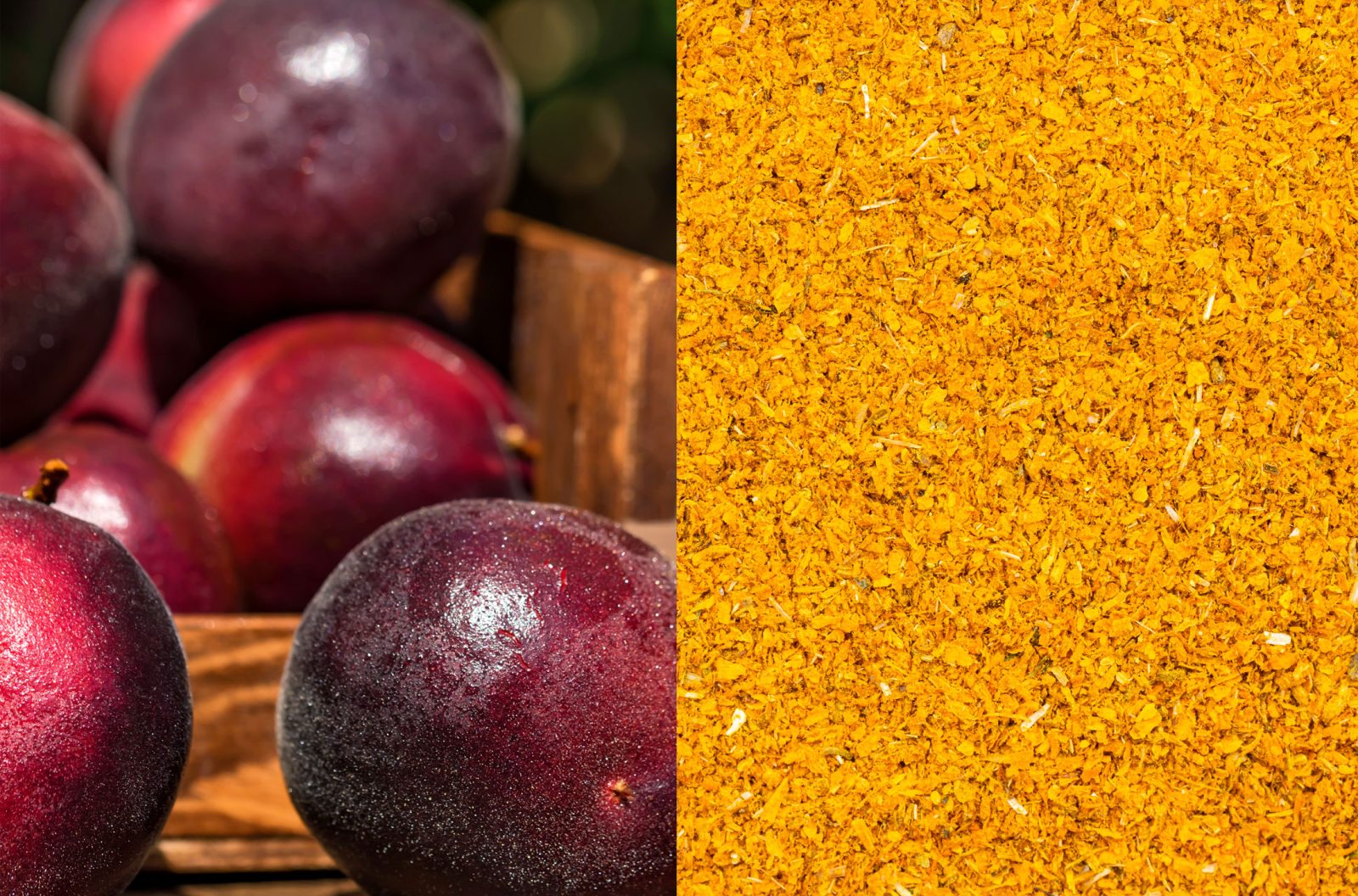
Our current color story development is being inspired by a few things. First of all, food and all of its glorious colors have been a constant part of our color conversations. From rich, deep plums to sunny (but not too sunny) saffron yellow. As always, nature provides us with more inspiration than we need. Imagine the saturated green of freshly-rinsed fava beans or the warmth of just-roasted coffee. The color options are endless.
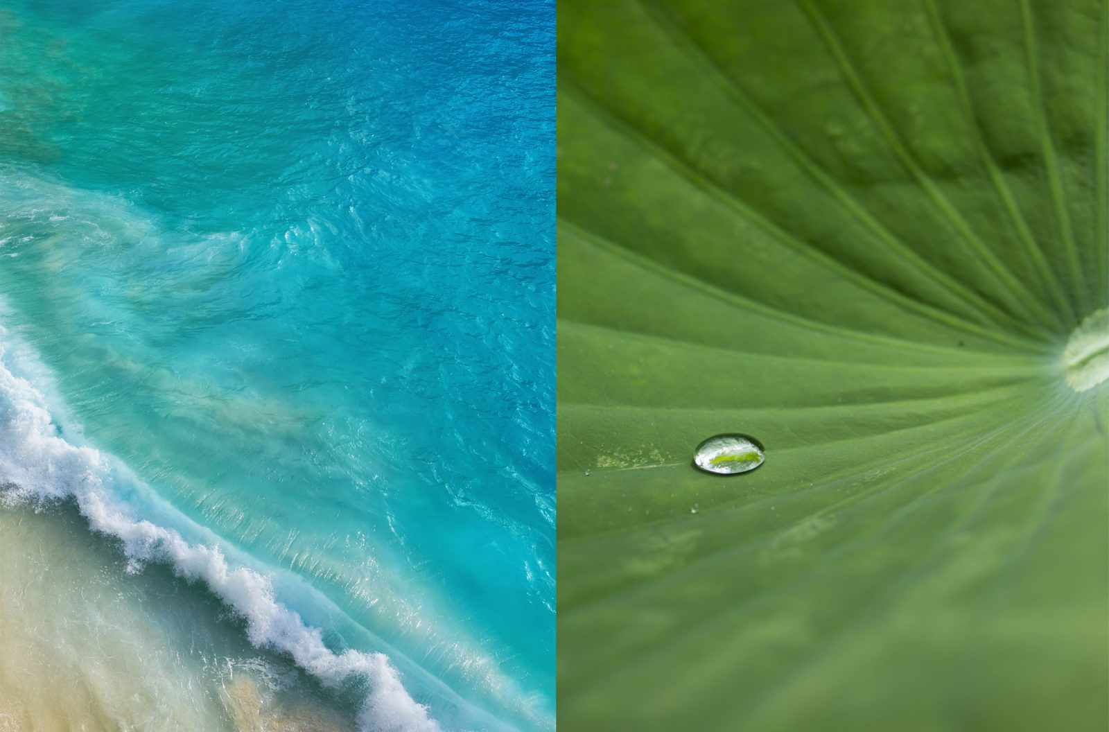
Travel is also a great influence on our color selections. Seeing how color is used throughout the world provides a unique perspective. From historic monuments to local, cultural celebrations, our recent travels have inspired us to think of color differently (see more about our recent travels HERE). The natural, outdoor spaces we visited gave us an entirely new rainbow of colors to consider. From the pristine beaches with azure waters in Vietnam to the delicious green of the lotus leaves in Kashmir, we were treated to a natural fan deck of inspiration (check out our Instagram account to see what we mean).
Lastly, we spent time at markets during our travels. Of course, there were many current trends on display. However, our goal was to determine if there were any emerging trends that fit with our plan. We discovered several things that indicated we were on the right track.
WHERE WE’RE HEADED

So what does it mean for designers and clients? You can expect the same, high-quality products you have always found at Seasonal Living. In terms of ceramics, look for richer, more saturated neutral colors; think latte, turmeric, or emerald. They will be accentuated by brighter jewel tones. In our ARCHIPELAGO COLLECTION, you will begin to see new products woven in warm shades of natural woods, bamboo, fire, and natural rattans.
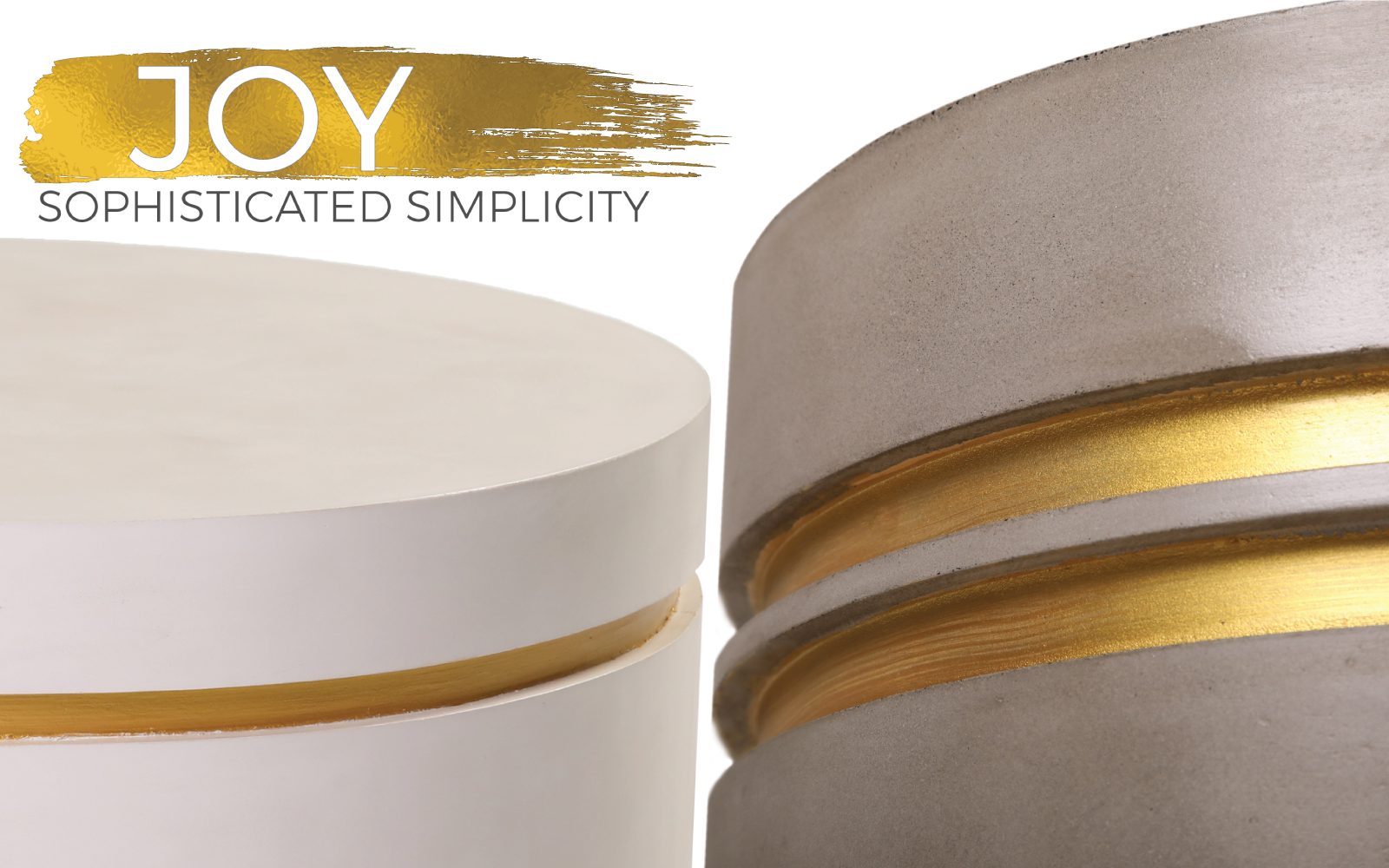
Our PERPETUAL COLLECTION will continue to include our signature lightweight concrete in slate gray and ivory white. In addition, our new JOY line within the PERPETUAL COLLECTION will have hand-finished touches of rich, muted gold lacquers. These simple, rich, elegant touches enhance the color of the concrete, making these exceptional pieces feel raw yet refined. Ivory whites and slate gray have always paired beautifully with rich metallic tones.
Whites, blacks, and grays will always be a part of the neutral base of our product offering. Our intent is to add a bit more of the natural earth spectrum from pyrites to rich chocolates to caramel browns all the way to the neutral linens and subtle creams. This will provide our customers with a palette mix to better reflect the creativity we think our customers like to see from Seasonal Living while still reflecting where we believe color trends are headed. This also helps to better round out our offering and provide designers and retailers with more options for changing client tastes.
This updated neutral base, combined with rich, deep color and fine, metal finishes, is the basis of our new color direction. The final color selections are not yet complete. Be on the lookout for a new array of products coming very soon.
USEFUL LINKS
seasonal living ceramics collection – https://www.seasonalliving.com/collection/ceramic-furniture/
global reconnections – https://www.seasonalliving.com/2022/08/business-travel-global-reconnections/
seasonal living instagram reels – https://www.instagram.com/seasonal_living_trd/reels/
seasonal living archipelago collection – https://www.seasonalliving.com/collection/archipelago-collection/
seasonal living perpetual collection – https://www.seasonalliving.com/collection/perpetual-collection/